


 English
 русский
 Español
 عربى
عربى

Content
Match or Contrast: Two Strategies for Choosing Gutter Colors
Every gutter color decision comes down to one of two strategies: make the gutters disappear into the exterior, or use them deliberately as a design element. Neither approach is inherently better — the right choice depends on what you want visitors to notice when they look at your home, and what the overall exterior composition already has going on.
The matching strategy — choosing a gutter color that closely follows the fascia, trim, or siding — is the safer and more widely used approach. When gutters share a color with the surrounding millwork, the eye reads the roofline as a single continuous element rather than a separate horizontal band. This creates a polished, unified appearance that works well for traditional, colonial, and craftsman homes where the architectural details themselves are meant to be the focal point. The practical upside is that small color inconsistencies — fading, minor dirt accumulation, slight pigment variation — are far less noticeable when the gutter blends into its context.
The contrasting strategy is more deliberate. Black gutters on a white or cream exterior create a sharp, graphic border that frames the roofline and gives the facade a contemporary edge. This approach works well for modern farmhouse and industrial-style homes, but it requires commitment: contrasting gutters are visible, and their condition, cleanliness, and color accuracy will be noticed. High-contrast combinations reward well-maintained systems and expose neglected ones. If the color coordination across the full system — gutters, downspouts, elbows, and brackets — is not consistent, the contrast that was meant to look deliberate will instead look mismatched.
A third path sits between the two: choosing a gutter color that is related to the exterior palette but not an exact match. Dark bronze gutters on a tan brick house don't match either the brick or the mortar, but they pull from the same warm family of tones. This low-contrast differentiation adds depth and visual interest without the commitment of a high-contrast choice, and it tends to age well as exterior colors shift slightly over time.
How to Coordinate Gutter Colors with Your Roof
Matching gutters to the roof is one of the most effective ways to create a seamless roofline — the gutter reads as an extension of the roof rather than a border around it. This works particularly well on homes without strong fascia or trim definition, such as modern and contemporary designs where the roof plane meets the wall with a clean, unornamented edge.
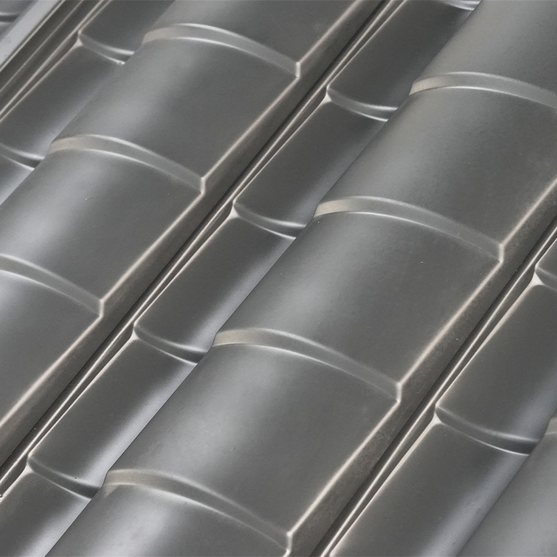
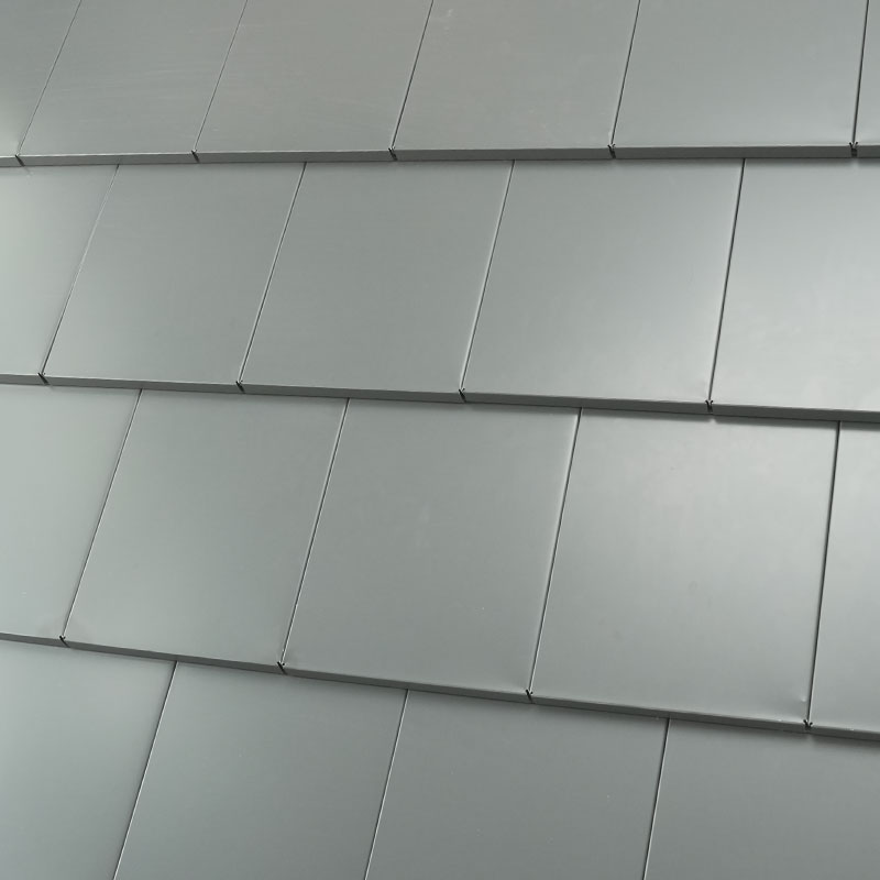
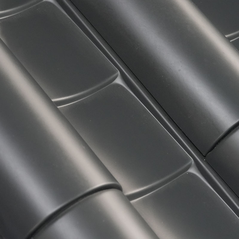
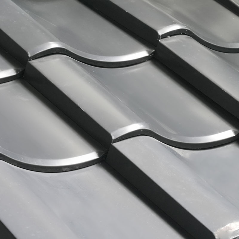
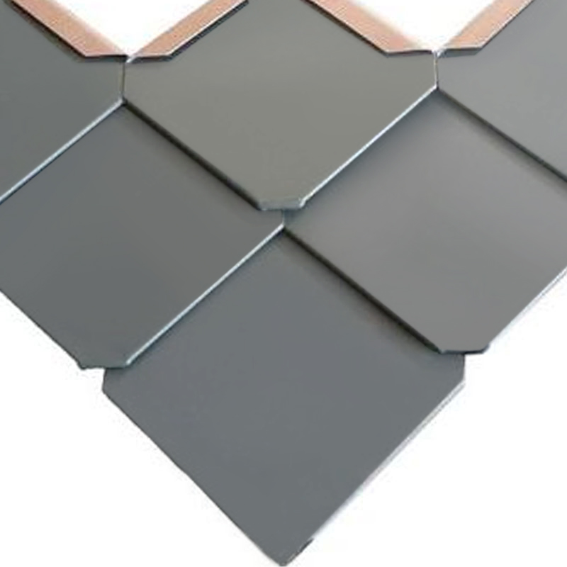
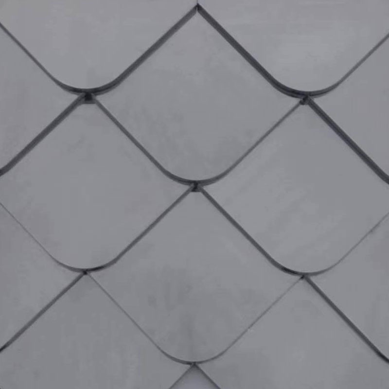
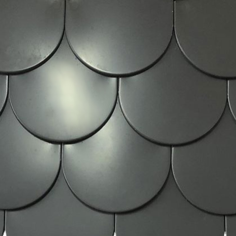
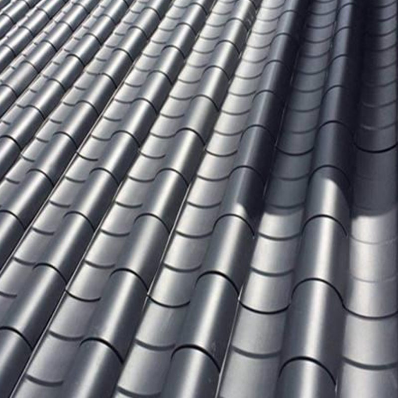
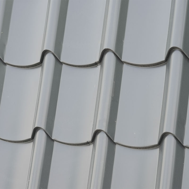
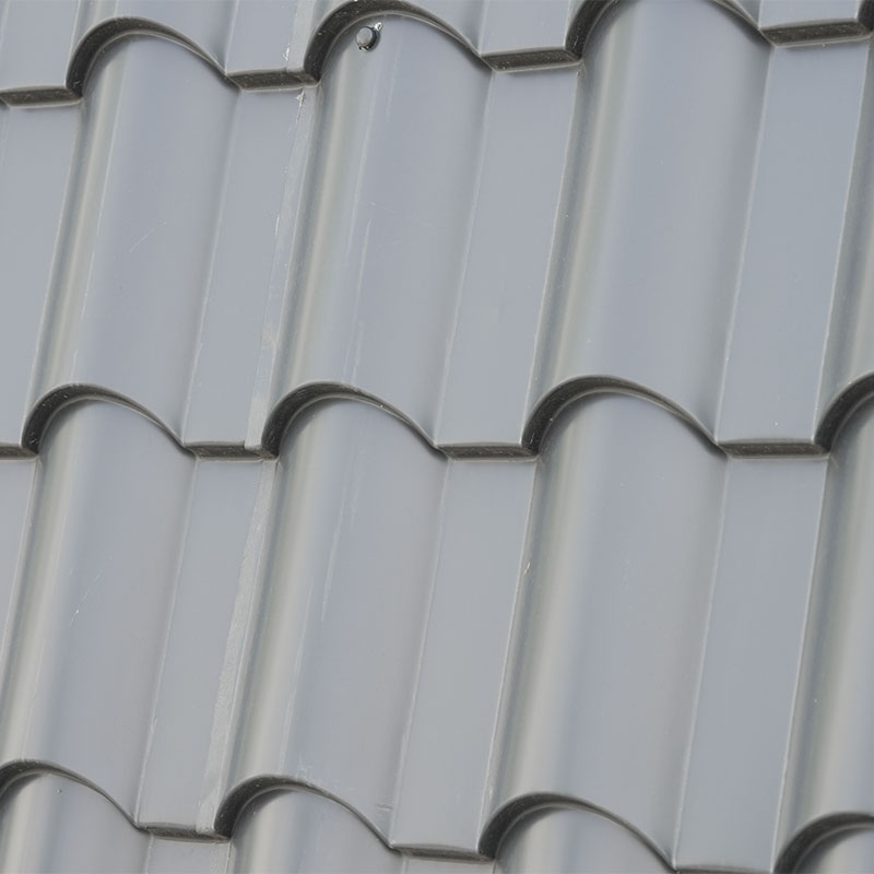
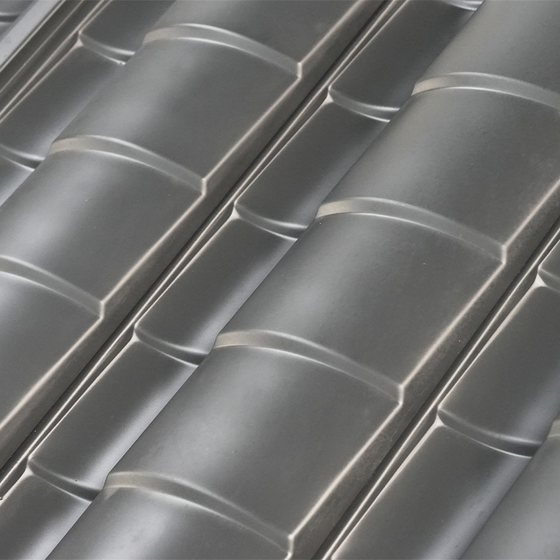
For dark charcoal or slate-gray roofing — common in asphalt shingle, metal panel, and fiber cement applications — charcoal or medium gray gutters are the natural complement. They maintain the tonal continuity of the upper building without exactly replicating the roof texture, which would create an overly uniform effect. Aluminum magnesium manganese roofing tiles for coordinated roof systems are available in a range of tones specifically designed to work as a complete system — specifying gutters from the same manufacturer ensures color compatibility across both the roof and the drainage system.
Brown and earth-tone roofs — terracotta, weathered wood, blended brown shingles — call for gutters in the same warm spectrum. Royal brown, musket brown, and dark bronze each work well depending on the depth of the roof color. The rule of thumb is to select a gutter shade that is one to two steps darker than the lightest tone in the roof, which keeps the gutter from looking washed out against a complex shingle pattern.
Black roofing — increasingly common in standing seam metal and premium asphalt products — offers the most flexibility. Because black is neutral relative to any other color, the roof does not impose a strong constraint on gutter selection. White gutters against a black roof create a clean, high-contrast look. Matching the gutters to the fascia produces a more integrated result. Dark bronze or charcoal gutters blend with the roof itself for maximum seamlessness. All three approaches are defensible; the choice comes down to the exterior color scheme below the roofline.
Matching Gutters to Siding, Fascia, and Trim
For most homes, the fascia and trim color is the single most reliable reference point for gutter color selection. Gutters are mounted directly to or adjacent to the fascia, which means the two surfaces are always seen together. When they share a color, the transition from roofline to wall reads as a clean, intentional line. When they differ, the gutter sits as a separate band that draws attention to itself — sometimes desirably, sometimes not.
White and off-white trim is by far the most common condition in residential construction, which is partly why white gutters remain the most widely installed option. They work because the match is already established — the trim sets the expectation, and the gutter meets it. The only situation where white gutters on white trim fails is when the white tones are substantially different (warm vs. cool white, or fresh vs. weathered), creating a visible mismatching that looks like an oversight rather than a deliberate choice.
For homes with gray, charcoal, or black trim — a configuration common in contemporary and transitional architecture — matching the gutters to the trim creates a strong, cohesive roofline with visual weight. This approach requires that gutter accessories including downspouts and elbows carry the same finish as the main gutter profile; a color-matched system that terminates in white or unpainted downspouts undermines the coordinated look immediately.
| Siding / Exterior Color | Match (Blend In) | Contrast (Stand Out) | Notes |
|---|---|---|---|
| White / Cream | White, Eggshell, Almond | Black, Charcoal, Dark Bronze | White is safe; black adds a modern edge |
| Gray / Light Gray | Medium Gray, Charcoal | Black, White | Match roof tone where possible |
| Beige / Tan | Almond, Clay, Wicker | Brown, Dark Bronze | Warm tones throughout unify the exterior |
| Red Brick | Brown, Ivory, Cream | Black, Dark Bronze | Avoid cool grays against warm brick |
| Dark Charcoal / Black | Charcoal, Matte Black | White, Light Gray | Match for stealth; contrast for drama |
| Wood / Cedar | Brown, Musket Brown, Bronze | Black | Warm tones reference natural materials |
Siding color is a secondary reference compared to trim and fascia for most homes. If the siding is a strong, distinctive color — deep navy, forest green, sage — matching the gutters to the trim rather than the siding typically produces a more stable result, since trim colors tend to be more neutral and are more commonly shared with the gutter color range. Matching gutters to a bold siding color risks an exact-match problem: the two surfaces are adjacent but not identical in material and texture, and slight color differences are amplified when the intent was an exact match.
Best Gutter Colors for Common Home Styles
Architectural style provides useful constraints that simplify the color decision. Each style has an established material and color vocabulary, and gutter colors that work within that vocabulary feel appropriate; those that don't create a visual friction that is hard to articulate but easy to feel.
Modern and contemporary homes benefit from gutters that reinforce the clean, restrained palette that defines the style. Charcoal, matte black, and dark gray are the dominant choices. These shades complement metal window frames, concrete cladding, and dark fiber cement panels. Downspouts in these applications are often routed internally or along recessed wall panels to minimize their visual impact — the gutter itself should be as unobtrusive as possible.
Traditional American and colonial homes have white or off-white trim as a foundational element. White gutters are the default and remain the most appropriate choice for the majority of these homes. Brown or bronze gutters work for traditional homes with warmer exterior palettes — brick or stone facades, cedar shingles, or earth-tone siding — where white would introduce a cool note that conflicts with the warm exterior materials.
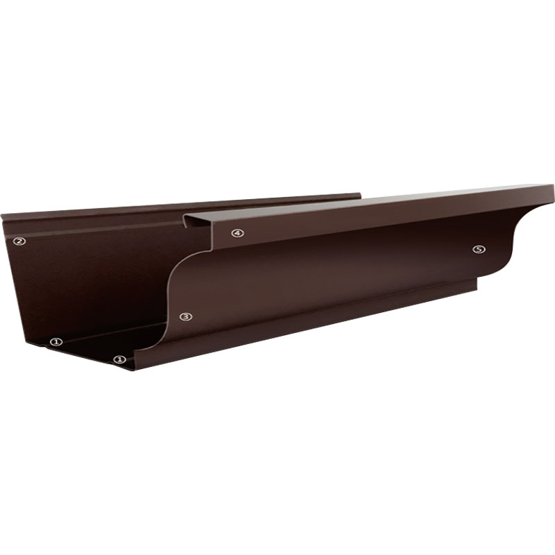
Craftsman and bungalow styles feature exposed rafter tails, wide overhangs, and a material palette that references natural wood and stone. Brown, bronze, and deep forest green gutters sit comfortably within this vocabulary. Half-round gutter profiles are historically appropriate for craftsman homes, and the color options within that profile are more limited — focusing on the warm brown-to-bronze range is usually the correct approach for both stylistic accuracy and color compatibility.
Modern farmhouse exteriors use white board-and-batten siding, black window frames, and black hardware as defining elements. Black gutters are the natural complement — they extend the same graphic contrast logic that defines the style. Matte finishes are more appropriate than gloss for this aesthetic. The combination of white walls, black windows, and black gutters has become something close to a formula for the style, and it works because the contrast is consistent and deliberate across all exterior elements simultaneously.
Climate and Maintenance Considerations
Color choice has practical consequences beyond appearance. In regions with high sun exposure, lighter gutter colors reflect more solar radiation and experience less thermal expansion and contraction over the course of a day. Darker colors absorb more heat, which can accelerate coating degradation over time in extreme UV environments — though premium powder coat formulations with UV stabilizers largely mitigate this concern for quality aluminum systems.
Dirt and stain visibility is perhaps the more immediately relevant practical factor. White and light-colored gutters show the characteristic "tiger striping" — vertical dark streaks caused by tannic acid and debris washing over the lip of the gutter — more readily than darker shades. In wooded settings with heavy leaf and organic debris, or in regions with frequent rain events, dark bronze, charcoal, or black gutters are significantly more forgiving from a maintenance perspective. They don't hide dirt, but they prevent the contrast between the clean surface and the stained areas from becoming as visually prominent.
In cold climates with significant snowfall and freeze-thaw cycling, gutter color has minimal impact on performance — the structural and finish properties of the aluminum alloy and powder coat matter far more than the color. However, homeowners in snowy regions often prefer darker gutters for the practical reason that they hide the residue left by ice and snow melt more effectively than white or cream options. Recommended maintenance practices for colored aluminum gutters cover the specific cleaning and inspection routines that keep both the color and the drainage function performing as intended across years of outdoor exposure.
Why Colored Aluminum Gutters Give You the Most Flexibility
The combination of aluminum's material properties and powder coat finishing technology gives colored aluminum gutters a design flexibility that no other gutter material approaches. Over 20 standard colors cover the common architectural color families, while custom powder coat matching against any standard color reference system allows specifiers to hit an exact target when the standard palette doesn't include it. This is not a theoretical capability — it's the practical reason why aluminum is specified for virtually every project where gutter color coordination with the exterior is a design requirement.
The color is also stable in a way that painted alternatives are not. A pre-finished, factory-applied powder coat carries a finish that has been cured at controlled temperature and applied at controlled thickness — two variables that field-painting cannot replicate. The result is a gutter system that enters service with a consistent, durable finish and maintains that appearance for decades rather than requiring repainting within a few years of installation.
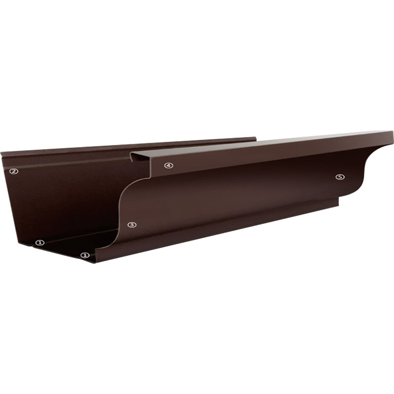
For homeowners and specifiers making a long-term investment in their building's exterior, the selection process is straightforward: identify the exterior color strategy (match trim, match roof, or deliberate contrast), choose a color family that executes that strategy, and specify a complete colored aluminum rain gutter system with fully color-matched accessories. The investment in getting the color right is negligible relative to the improvement in exterior coherence — and a gutter system that belongs to the exterior palette rather than conflicting with it is one of those details that significantly improves a home's curb appeal without requiring any structural changes to achieve it.